Another font evolves in the digital realm

  • Post author:
Read more about the article Another font evolves in the digital realm
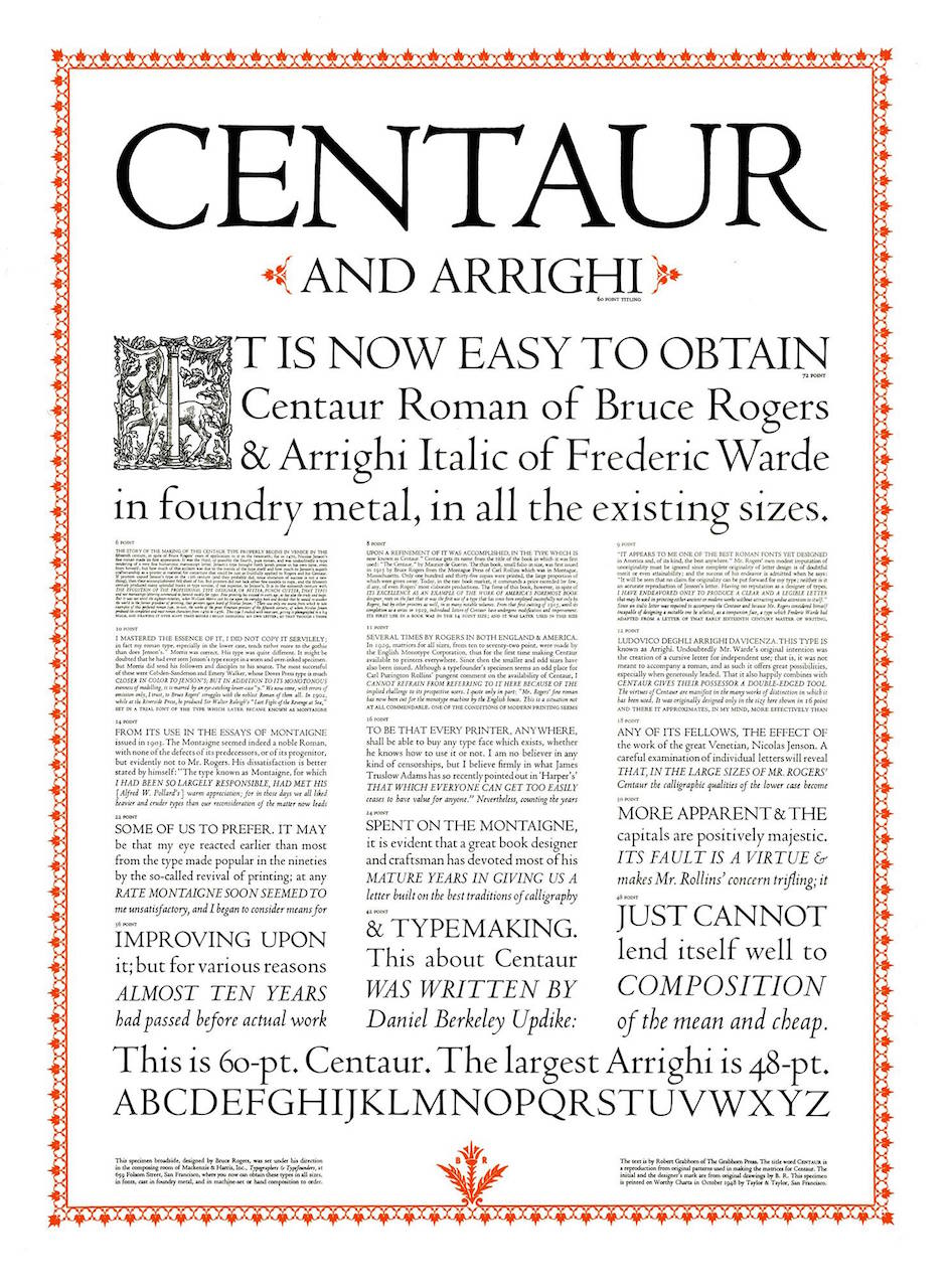
Advertisement for Centaur typeface from 1948

Recently, I've been reading about T.E. Lawrence (also known as John Hume Ross, T.E. Shaw, and thanks to Hollywood – Lawrence of Arabia). In my research I came across a story about how Lawrence came to write a translation of Homer's The Odyssey. Most people aren't aware that Lawrence was trained as a historian and archaeologist, not a military strategist. Leading up to WWI, it was his knowledge of the region from his work as an archeologist that convinced the British army to arrange an archeological survey of the Negev desert as a ruse for actually mapping the region for the military. That experience led him to join British Intelligence in Cairo, where he eventually would be sent to help organize the Arab rebellion against the Ottoman Empire that made him famous (some would say infamous). While Lawrence's exploits during WWI made him famous, his life after WWI isn't very well known. Shunning the spotlight, he actually managed to re-enter the military under false names – first the Royal Air Force (RAF), then the Royal Tank Corps, then back to the RAF. It was while working as a clerk in the RAF that he was contacted by a friend who had met the…
Continue ReadingAnother font evolves in the digital realm

From bibles to web sites, the century-long trek of one font

  • Post author:
Read more about the article From bibles to web sites, the century-long trek of one font
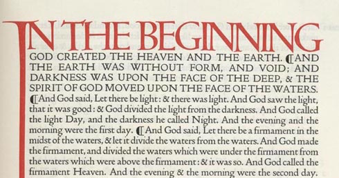
Part of the first page of the Doves Press edition of the Bible

I appreciate a good font, and I certainly appreciate good typography. Reading badly laid out books can be painful (although my threshold is much higher than my friends who are typographers by trade). The over-use of Comic Sans or Papyrus fonts is not something that just bothers me. Recently I read about the resurrection of a font last used over a century ago. The story is quite incredible. Two men founded a publishing company, one bringing the creative side (Thomas Cobden-Sanderson) and the other the money (Emery Walker). The company, Doves Press, created a new font (new, although based on a font from the 15th century) to be used in their publications, which included an edition of the Bible, as well as books by well-known authors such as John Milton, whose Paradise Lost published by Doves is nothing less than a masterpiece of bindery, before even getting to the contents. Trouble Begins When the publishing company ran into financial trouble, the partners fought over the single remaining asset of the company – the typeface. Today we think of fonts as digital files on a computer. We don't think about how much time goes into designing them, especially since anyone who wants…

Continue ReadingFrom bibles to web sites, the century-long trek of one font

End of content

No more pages to load