Recently, I’ve been reading about T.E. Lawrence (also known as John Hume Ross, T.E. Shaw, and thanks to Hollywood – Lawrence of Arabia). In my research I came across a story about how Lawrence came to write a translation of Homer’s The Odyssey. Most people aren’t aware that Lawrence was trained as a historian and archaeologist, not a military strategist. Leading up to WWI, it was his knowledge of the region from his work as an archeologist that convinced the British army to arrange an archeological survey of the Negev desert as a ruse for actually mapping the region for the military. That experience led him to join British Intelligence in Cairo, where he eventually would be sent to help organize the Arab rebellion against the Ottoman Empire that made him famous (some would say infamous).
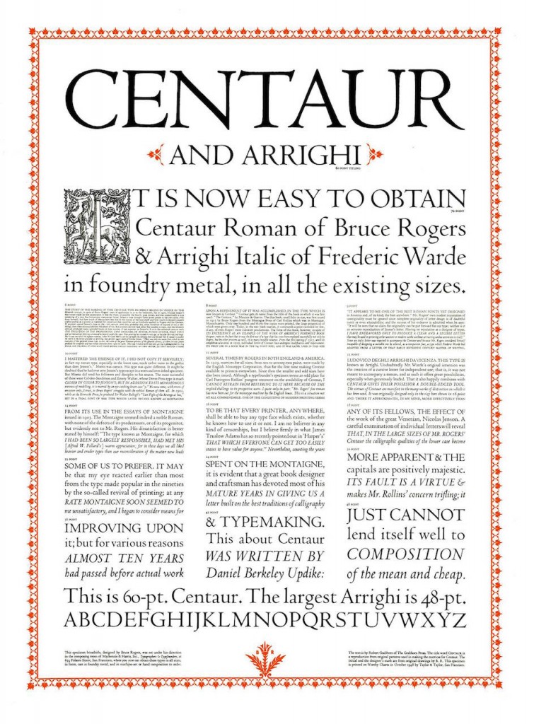
While Lawrence’s exploits during WWI made him famous, his life after WWI isn’t very well known. Shunning the spotlight, he actually managed to re-enter the military under false names – first the Royal Air Force (RAF), then the Royal Tank Corps, then back to the RAF. It was while working as a clerk in the RAF that he was contacted by a friend who had met the famous book designer Bruce Rogers. Rogers had told his friend that he had been commissioned to create a new translation of Homer’s The Odyssey, and then design the new book. His friend had discussed T.E. Lawrence with him, and suggested he do the translation. Prior to that time, Lawrence had only published his memoir, The Seven Pillars of Wisdom (and an abridged version called Revolt in the Desert) and a translation of a French novel, although he had learned classic Greek in school. In the ensuing back-and-forth about the translation, Bruce Rogers mentioned in passing that The Monotype Company was ‘cutting’ his Centaur typeface. Cutting in this sense was literally cutting the typeface out of metal so it could be used in a printing press.

I wrote back in February about another font, now called The Doves Type, which interestingly enough was also based on the work of of the same 15th century book printer/designer Nicolaus Jenson. There was perhaps more intrigue in the story of the The Dove Type, which you can read about in my post From bibles to web sites, the century-long trek of one font. What’s interesting is that when I started writing this post about another font, I didn’t know that it was also based on the work of Jenson.
If you go to Monotype’s web site today, the only mention of Centaur on their site is that they own the trademark for it, although you can find it for sale from Linotype (a Monotype subsidiary), fonts.com (also owned by Monotype), and other related sites. Adobe used to also sell a version of Centaur, but from what I can tell no longer do so. Adobe does, however, sell Adobe Jenson Pro, based on the same font that Centaur was originally modeled on, and thus is similar. Perhaps Adobe licensed Centaur from Monotype before digital type was as widespread, and created an early digital version of it, I’m not sure.
Linotype has a good description of Centaur on their site:
Centaur is probably the best known re-creation of the roman type cut by Nicolas Jenson in the fifteenth century. The great American typographer and book designer, Bruce Rogers, was commissioned to design an exclusive type for the Metropolitan Museum of Art (New York) in 1914. Rogers, who wanted to emphasize the written quality of the letter shapes, enlarged photos of Jenson’s type and drew over the letters with a flat pen. He then selected the best letters and touched them up with a brush and white paint, and the new type was cut from these patterns by Robert Wiebking. It was named Centaur after the title of the first book designed by Rogers using the type: The Centaur” by Maurice de Guérin, published in 1915. Lanston Monotype of London cut the commercial version of Centaur and released it in 1929. Rogers convinced Frederic Warde to design the italic, which was given its own separate name of Arrighi. Because Jenson did not cut a companion italic, Warde used as his models the types cut by Ludovico degli Arrighi in 1524-27. He inclined the caps and shortened the ascenders so it would go better with the height of Centaur’s ascenders. The lowercase italic g is a notable character because it has no ear. The current digital version of Centaur has both roman and italic, and includes bold weights, small caps, alternates and swashes. The difference between Centaur Italic and Centaur Italic (Arrighi) is in the lowercase z. Use the Centaur family for book composition, headlines, and elegant advertising pieces.
Typefaces are a funny thing, since early typeface designs (such as those of Jenson, who lived over five hundred years ago) are obviously not protected by any kind of copyright or trademark. Sometimes many later type designers used these early typefaces as inspiration or copied them outright. Those copies were then copied, etc. As further illustration of this point, the fonts Cambridge Serial (by Softmaker), LTC Metropolitan (by Lanston Type Company) and Venetian 301 (by Bitstream) are all basically versions of Centaur, which of course is a version of Jenson’s original Roman font from over 500 years ago, that inspired Adobe’s Jenson Pro and Linotype’s Jenson Classico.
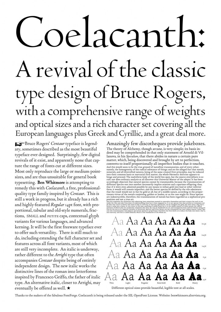
There is another digital version of Centaur that is under development, and the interesting thing about this version is that it is free. The font is called Coelacanth, and it’s made freely available through the Open Font Library. I suppose the name is related to the fact that the Coelacanth is a fish that is believed to have evolved into its current state hundreds of millions of years ago, and stayed the same since, and Jenson’s original designs are over 500 years old and still being used. The font is a work-in-progress by Ben Whitmore, who writes about the project, as well as more specifically his efforts to create italic and bold variations. One of the goals of Coelacanth is to create a font with a wide range of optical sizes, so even in the smallest sizes the font would look good, something that was true of the metal-cut Centaur font, and which Ben Whitmore wants to reproduce with his digital version. Here’s a demo sheet of Coelacanth:

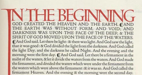
It’s amazing to think how one man’s work over five hundred years ago has influenced so many designers, and so many book designs, and that it continues to inspire people to this day. If you’re still wondering about T.E. Lawrence and how a story that started with Lawrence ended up about a digital font, all I can say is that Lawrence did indeed translate The Odyssey, and it was published by Bruce Rogers in 1932. You can pick up a copy on Amazon if you want, although I’m not sure the paperback version on offer there utilizes Roger’s original layout and his Centaur typeface. If you’re interested in the creation of Centaur itself, it seems there is a forthcoming book on the topic called The Noblest Roman (Amazon).

It’s a good article. I’m a veteran typographer and a professor of design. I’m not a purist, but one look at the Coelacanth typeface tells me that Whitmore does not yet understand what Centaur is all about. The Coelacanth variants are rather tasteless. The boldest and thinnest variants merely carry the skeletal shape of Jenson and Rogers, and nothing of the feel. I’m not sure if you can see this yourself. Ask a Boston calligrapher (there are quite a few) or ask one of the many typographers there to explain what exactly is wrong with Coelacanth.
I have to add that your article would be more credible if you were to check spelling. It’s “Rogers” not “Rodgers.”