From bibles to web sites, the century-long trek of one font
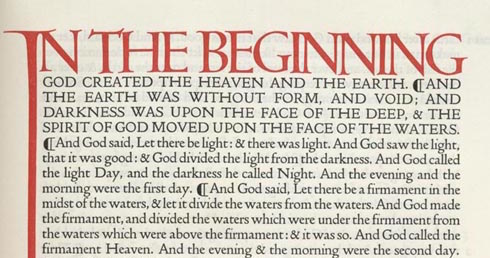
I appreciate a good font, and I certainly appreciate good typography. Reading badly laid out books can be painful (although my threshold is much higher than my friends who are typographers by trade). The over-use of Comic Sans or Papyrus fonts is not something that just bothers me. Recently I read about the resurrection of a font last used over a century ago. The story is quite incredible. Two men founded a publishing company, one bringing the creative side (Thomas Cobden-Sanderson) and the other the money (Emery Walker). The company, Doves Press, created a new font (new, although based on a font from the 15th century) to be used in their publications, which included an edition of the Bible, as well as books by well-known authors such as John Milton, whose Paradise Lost published by Doves is nothing less than a masterpiece of bindery, before even getting to the contents. Trouble Begins When the publishing company ran into financial trouble, the partners fought over the single remaining asset of the company – the typeface. Today we think of fonts as digital files on a computer. We don't think about how much time goes into designing them, especially since anyone who wants…